The 21st century henhouse
Occasionally, despite my best efforts, I actually finish a project. This happened with the remote chicken coop monitor last week. The last glitch was ironed out, and it's been happily reporting on the state of the chicken coop ever since.
Our coop, home to about 30 chickens, is solar powered. A small panel charges a lead-acid battery which runs the 12V lights. I'd like to keep an eye on the battery state, and my spouse has had a long-standing request for a confirmation each night that the coop door is closed.
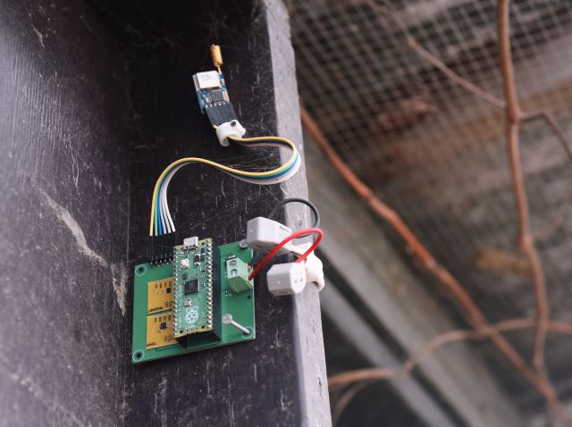
Hence the coop monitor. It's a Raspberry Pi Pico doing the sensing, with a 915 MHz Lora module to transmit the status back to the base. It's powered by the coop's 12V battery via a 5V linear regulator. Simple stuff. There are three sensors:
- battery voltage, just a resistor divider running into the Pico's analog input
- temperature, using an Electric Dollar Store I2C temperature sensor
- door open/closed, using an Electric Dollar Store magnetometer
 Instead of using a switch for the door sensor, the whole assembly is mounted on the coop door, and the magnetometer senses the board's orientation. It reports a 3-axis (X, Y, Z) orientation in Earth's magnetic field like this when the door is closed:
{"seq": 58757, "temp": 10.38, "magnet": [-426,-1224,-2535], "vbatt":12.60, "uptime": 602765907496}
when the door is open, it reports a different triple, for example:
{"seq": 50426, "temp": 12.75, "magnet": [34, -344, 314], "vbatt": 12.63, "uptime": 517299796209}
So distinguishing between door open/closed is really simple, there's no need for complicated calibration.
Of course this is a tradeoff. Instead of a moving part (a door switch) the whole board moves because it is fixed to the door. So the power cable has to flex. This caused some glitching, but by using a length of speaker cable, and a couple of these excellent lever wire nuts, it's been rock solid.
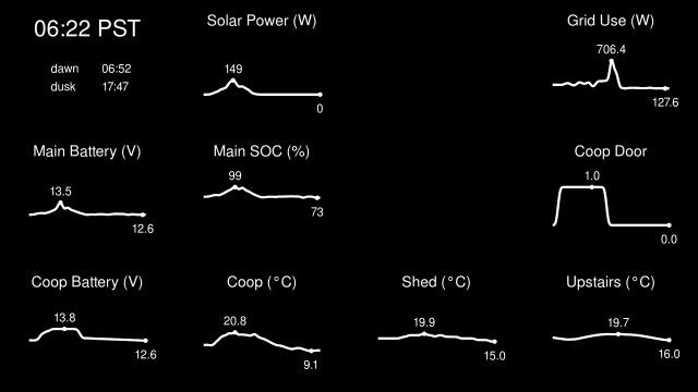
The graphs are all 24-hour sparklines (confession: I am a longtime Tufte fanboy). I originally wanted to style the graph a bit like these ones from goaccess, a nice web log analyzer.
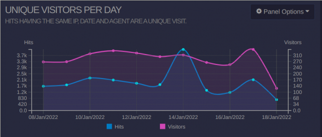
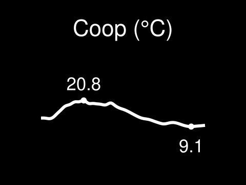
But appealing though this is, Tufte would dismiss a lot of what's on the graph as chartjunk - visual clutter. So I ended up plotting all the data as a 24-hour sparkline with min and max values highlighted. There's no scale, or even current value, because the minimum and maximum are the important functional elements.
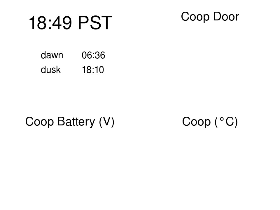
Assembling these charts into the house dashboard gives an all-business display of the current state of our homestead.
Thanks for reading. If you want more details on this or any other newsletter topic, just let me know and I will add it to the queue.